Brand identity · Website · Launch
rePete
A reorder platform that needed a personality as well timed as its nudges.
The brief
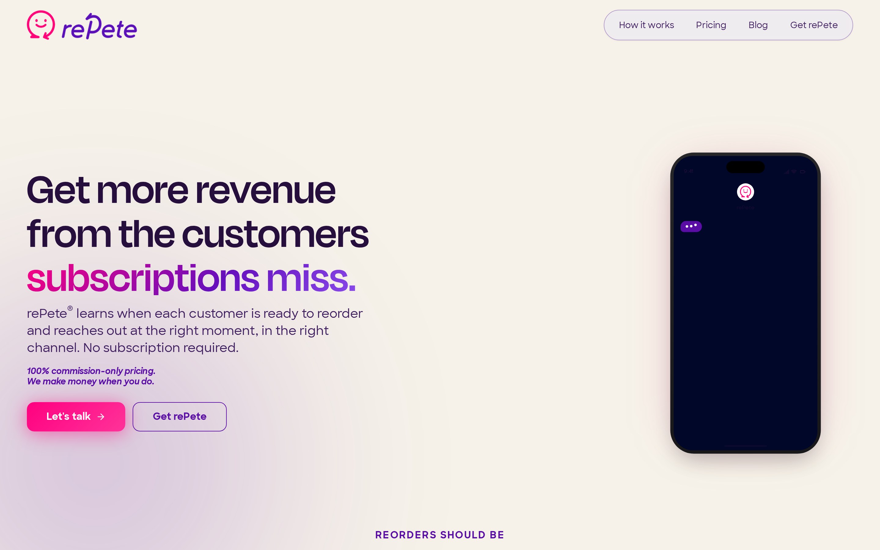
rePete learns when each customer is ready to reorder and reaches out at the right moment, in the right channel — no subscription required. The product was new, the category was crowded, and the pitch had to land in seconds.
I built the brand from the name out: a friendly wordmark and smiling chat-bubble mark, a magenta-to-violet gradient palette, and a warm off-white ground that keeps the energy on the message instead of the chrome.
The website carries that system through a bold headline hero, a phone-in-hand product moment, a scrolling “reorders should be” marquee, and clear commission-only pricing. Launch materials extended the identity across social, sales decks, and app-store assets so the team could go to market in one voice.
Scope
- Brand strategy & naming support
- Logo and visual identity
- Website design & build
- Launch campaign materials
- Sales and social collateral
Live site
repete.me
Visit the site